I'm starting to hate using YouTube
Something about using YouTube these days just feels hostile. Ads seem to have been cranked to 11, the content algorithm is relentless in showing me stuff I don't care about, and more and more it seems like new channels that do seem to interest me are all sizzle no sausage (as it were).
But that's content stuff - today I'm nitpicking the UI.
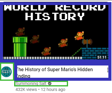
Basically, I might look at a thumbnail like this one:

And expect that I can click, broadly, anywhere on it to get to the video. Something like this:

Where the blue boxes take me to the video, and the green ones get me to the person's channel. Nothing complicated, everything visible and obvious.
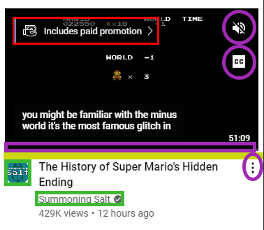
But as soon as your cursor touches the image, everything changes, and the truth becomes this:
 I've had to change the colour scheme to remove the actual "gets you to the video" parts - it's easier to just omit that.
Green gets you to the channel.
Purple stuff mostly appears when you hover over and they are controls rather than links - the preview video player necessitates all this and just makes the whole YouTube experience worse.
The little gold band is a gap between the thumbnail and the title for some reason? I've clicked on that gap more times than is reasonable, in attempting to avoid clicking on the progress bar and skipping half the video.
And the red part takes you to a page explaining what a paid promotion is for some reason.
Guys I just want to click on the video, why are you making this such a ball-ache? It's a full 10% (possible hyperbole, I'm not counting pixels) of the section allotted to the video, just wasted on cruft.
This is one of many UI/UX complaints I have about the site, but I'll leave it at that for now. I don't think anyone would choose to design a website like this from scratch, this stinks of iterative ruination.